It’s been way too long since I posted an update. I keep waiting for a firm publication date, but things have been delayed at the publisher, both for the release of The Double Crossing and the reprint of The Weaver’s Daughter. I still don’t have a firm date, but things are moving along.
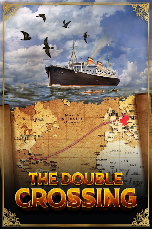
I have an early draft cover image for The Double Crossing which I’m going to copy here. I’d love to have your opinion/suggestions.
And here’s an excerpt from the first page of the book. I hope it sparks your interest.
FRIDAY , M AY 12, 1939
HANNAH
THE BLACK BULK OF THE ST . LOUIS loomed several stories
above the dock where I stood with Mother. Lifeboats and
two mustard-colored funnels striped with red, white, and black
caught my eye. Then I noticed something else red, white, and
black. A swastika flag! It hung at the back of the ship, above the
flag of the ship’s owners, HAPAG, the Hamburg America Line.
Gripping Mother’s hand, I pointed.
“Look Mutter! It’s a Nazi ship!”
“It doesn’t mean anything Hannah, Leibling. All German
ships must fly the Nazi flag.” Mother stroked my hair. “Everything
will be fine. You have your ticket, passport, and landing permit.
Ruth will watch out for you.”
Ruth! I hardly knew her. I was only thirteen and she was
eighteen, the daughter of mother’s friends from synagogue.
“But Mutter, I don’t want to leave you. They could send you
to a camp too.”

Nice contrast between the blue ocean and the yellow map.
Well – since you asked for an opinion I find I have one. But I have no artistic credentials. I find the font of âDouble Crossingâ at cross purposes with the imagery. And the whole cover is a bit too much – maybe let the simple image on top take up â of the page, and the map with a simple a plain square font use the bottom third. The way it is now seems too busy.
Hope you are well.
Barbara
>
Thanks Barbara. I agree. I told the art director the same.
Sylvia